Wavelet Kernel Selection in Wavelet Transform
In the previous article, we discussed what wavelet transform is. However, one key question remained: how do we choose the most suitable wavelet among many candidates? This post introduces several practical ideas for solving that problem.
First, what is the actual difference between wavelet types? In discrete wavelet transform, wavelets are generally divided into orthogonal wavelets and non-/biorthogonal wavelets. Orthogonal wavelets use the same wavelet pair for both decomposition and reconstruction, while non-orthogonal (or biorthogonal) wavelets use different pairs for decomposition and reconstruction. According to the pywt documentation, orthogonal families include haar, Daubechies, sym, coif, and demy; non-orthogonal families include rbio and bior.
For orthogonal wavelets, filter coefficients are mutually orthogonal and satisfy Parseval’s energy conservation theorem. Their advantages include strong theoretical foundation, compact support, and sparse coefficients, but they are generally asymmetric. They are also easy to use because decomposition and reconstruction rely on the same wavelet pair (high-pass and low-pass).
Biorthogonal wavelets, on the other hand, contain redundancy but offer symmetry, low reconstruction error, and no phase shift. Their downside is that they do not satisfy Parseval’s theorem, and usage is less convenient because decomposition and reconstruction use different wavelet pairs. The following figure shows representative wavelet families:
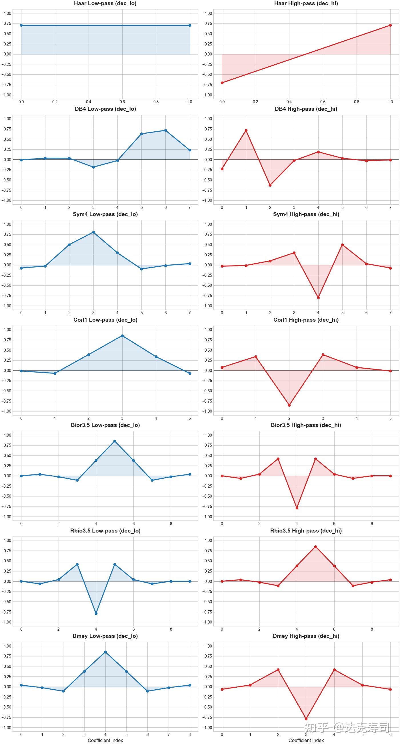
Coefficient plots of different wavelet families
Overall, we cannot conclude that one category is universally better than another. These are theory-level properties from wavelet design; practical choice still depends on empirical results.
Evaluation Metrics for Wavelet Kernels
When we are given a new dataset, how should we pick a wavelet? We can use the following evaluation metrics to determine which wavelet fits the data best: sparsity, energy concentration, entropy, reconstruction error, thresholded reconstruction error, and kernel length penalty. All of these metrics are computed with respect to the actual data.
- Sparsity measures whether most wavelet coefficients are close to zero after transformation. One common metric is the Gini Index. First sort absolute coefficients in ascending order: $$|d|_{(1)} \le |d|_{(2)} \le \dots \le |d|_{(n)}$$ Then compute: $$Gini(d)=1-2\sum_{i=1}^{n}\left( \frac{|d|_{(i)}}{\|d\|_1} \cdot \frac{n-i+1/2}{n} \right)$$ If only a few coefficients are large and the rest are near zero, Gini approaches 1.
- Energy concentration is essentially a Top-k ratio: the proportion of total energy contributed by the top k% coefficients. Let $ E = {d_1^2, d_2^2, \dots, d_n^2}$ be the energy sequence, sorted in descending order as $E_{(1)} \ge E_{(2)} \ge \dots \ge E_{(n)}$: $$Loss_{energy} = 1 - \frac{\sum_{i=1}^{k} E_{(i)}}{\sum_{j=1}^{n} E_{(j)}}$$
- Entropy indicates whether coefficient distribution is random or structured. Define probability density $p_i$ (energy share of each coefficient): $$p_i = \frac{d_i^2}{\sum_{j=1}^{n} d_j^2 + \epsilon}$$ Normalized entropy is: $$Loss_{entropy} = \frac{-\sum_{i=1}^{n} p_i \ln(p_i)}{\ln(n)}$$
- Reconstruction error measures whether decomposed features preserve the original signal information. In theory, if wavelet pairs are orthogonal, captured components are independent and reconstruction error should be near zero. This makes it a strong loss term for learnable wavelets, since randomly initialized wavelet weights may not be orthogonal: $$Loss_{rec} = \frac{1}{M} \sum_{i=1}^{M} (x_i - \hat{x}_i)^2$$
- Thresholded reconstruction error applies a threshold to wavelet coefficients, sets all coefficients below it to zero, and reconstructs the signal from the thresholded coefficients. This is a typical denoising operation. If reconstruction error remains low, the wavelet is likely suitable for the signal.
- Length penalty penalizes overly long wavelets. By Occam’s Razor, if both a simple and complex wavelet represent the signal well, the simpler one is preferable. In practice, simplicity often corresponds to shorter kernel length, so longer wavelets should incur a penalty: $$Penalty_{length} = \frac{\ln(L)}{\ln(L_{max})}$$
I named these metrics using a loss-style convention because they can both evaluate wavelet quality and serve as training losses for learnable wavelets. The key question is: do these metrics truly correspond to real-world performance?
Wavelet Transform in Practice
For practical experiments, this post uses two open-source dataset collections. The first is LOTSA:
The Large-scale Open Time Series Archive (LOTSA) is a collection of open time series datasets for time series forecasting. It was collected for the purpose of pre-training Large Time Series Models.
Dataset link: https://huggingface.co/datasets/Salesforce/lotsa_data
The second is the widely used UCR time-series classification archive:
https://www.timeseriesclassification.com/
Note that LOTSA is used for time-series forecasting, while UCR is used for classification.
Using PyWT, I collected 106 discrete wavelet pairs. For forecasting tasks, the training process is:
for wavelet in wavelet_list:
    coef = DWT(data) # DWT: discrete wavelet transform
    pred_coef = model(coef, wavelet)
    pred_data = IDWT(pred_coef, wavelet) # Inverse DWT
    loss = mse(pred_data-true_pred)
    loss.backward()
For classification tasks, the training process is:
for wavelet in wavelet_list:
    logit = model(data, wavelet)
    pred = softmax(logit)
    loss = crossEntropy(pred,true_pred)
    loss.backward()
The model architecture feeds coefficients from each level into an LSTM (or another sequence model such as Mamba), then applies a final fusion step.
Combined, the two collections contain 509 datasets. For each dataset, 106 wavelets each produce one performance score: MSE for forecasting and accuracy for classification. This yields a 509*106 performance pivot table. At this stage, absolute values are less important than ranking. Based on ranking, I converted the scores into the following figure:
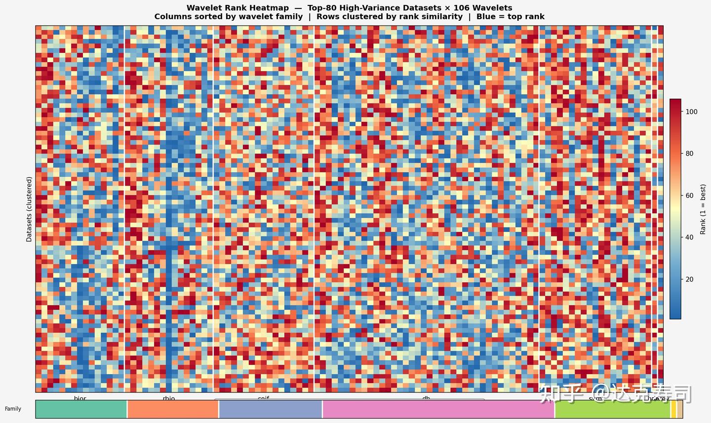
Wavelet performance score pivot table
In the figure above, each pixel represents model performance for one dataset-wavelet pair: red is the lowest rank and blue is the highest. The y-axis is datasets, the x-axis is wavelets, and wavelet families are color-grouped as bior, rbio, coif, db, sym, haar, and demy.
As we can see, almost no wavelet dominates across all datasets. However, the rbio family clearly contains more high-ranking wavelets (larger blue proportion), followed by bior and db. This suggests biorthogonal wavelets are particularly suitable for time-series modeling. Among orthogonal families, db performs relatively well but with larger variance; other orthogonal families generally trail db. In practice, for time-series tasks (both regression and classification), rbio is often a strong first choice, and one medium-length rbio wavelet appears broadly effective across datasets.
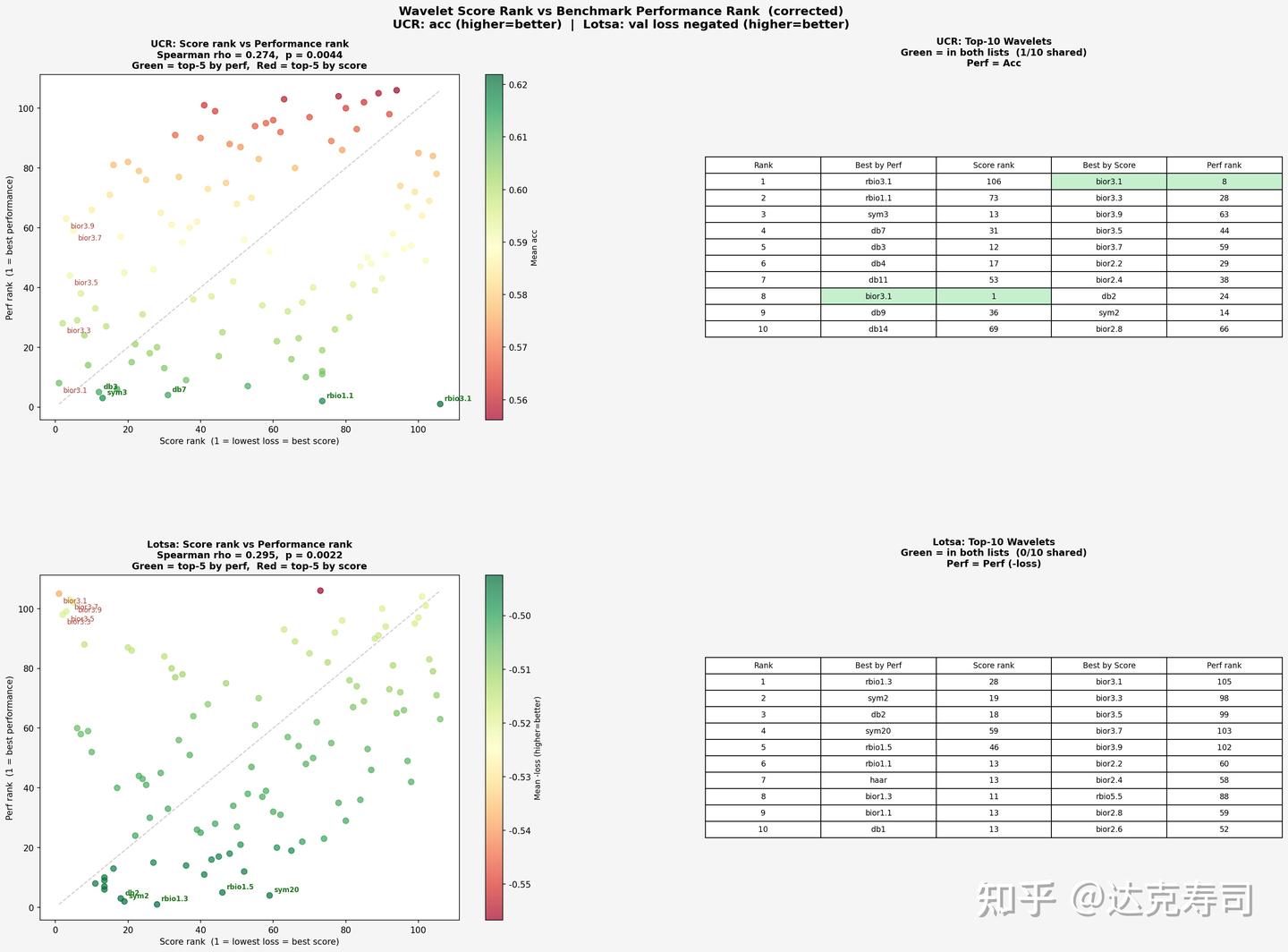
The next question is whether earlier evaluation metrics (sparsity, energy concentration, etc.) can actually reflect real performance. If they can, researchers could select wavelets by metric computation instead of running many full experiments, saving significant time. With that in mind, we compare metric-based ranking and true performance ranking below:
Wavelet metric-based ranking vs. true performance ranking
From this figure, UCR and LOTSA show similar patterns. Based on metric ranking, bior3.1 takes first place with a large margin, followed by other biorthogonal wavelets. But from the second column (true wavelet performance), metric ranking does not fully capture real performance. Still, bior3.1 again appears at the top positions. Next, we examine correlation using Spearman coefficients (correlation between each dataset’s metric vector and true-performance vector):
Correlation between metric ranking and true performance
Overall, the relationship is positively correlated. UCR appears relatively self-consistent: wavelets with strongest true performance also tend to align with better metric values (concentrated near the lower-left region). LOTSA shows some extreme cases, where certain high-performing wavelets appear in the upper-left region, suggesting that for LOTSA (forecasting tasks), wavelets with poor metric scores can still perform strongly in practice. Next, let’s inspect correlation by individual metric:
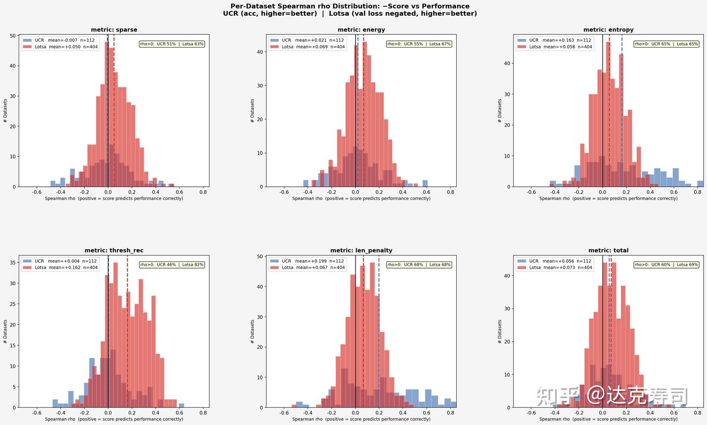
Correlation between individual metrics and true performance
For the majority of datasets, wavelet performance and evaluation metrics are weakly related, since most correlation coefficients are close to zero. However, comparatively speaking, thresh_rec is quite useful for LOTSA, and entropy is very useful for UCR. As for len_penalty, results also suggest that shorter wavelets are more likely to achieve better true performance on UCR. In short: for forecasting tasks, thresh_rec is more informative; for classification tasks, entropy is more informative.
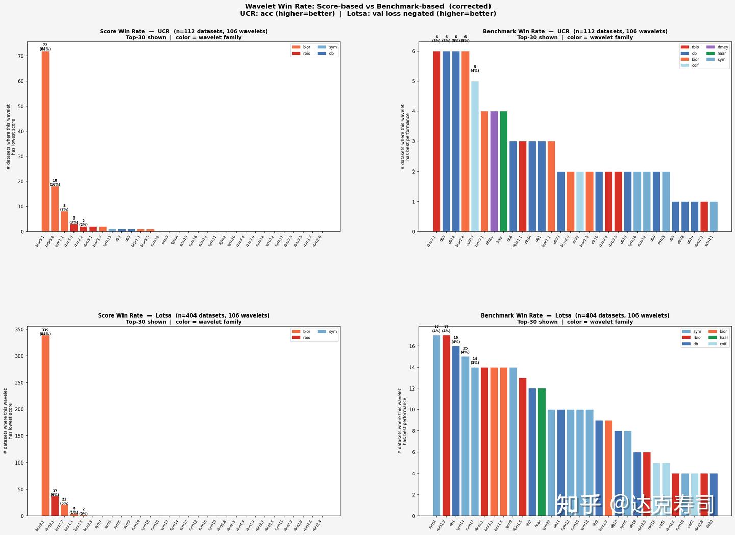
Since metric utility is limited, is it a better strategy to simply choose wavelets that most frequently rank near the top in true performance? Let’s look at the following figures:
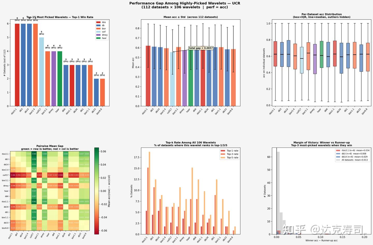
True-performance gaps among top-ranked wavelets (UCR)
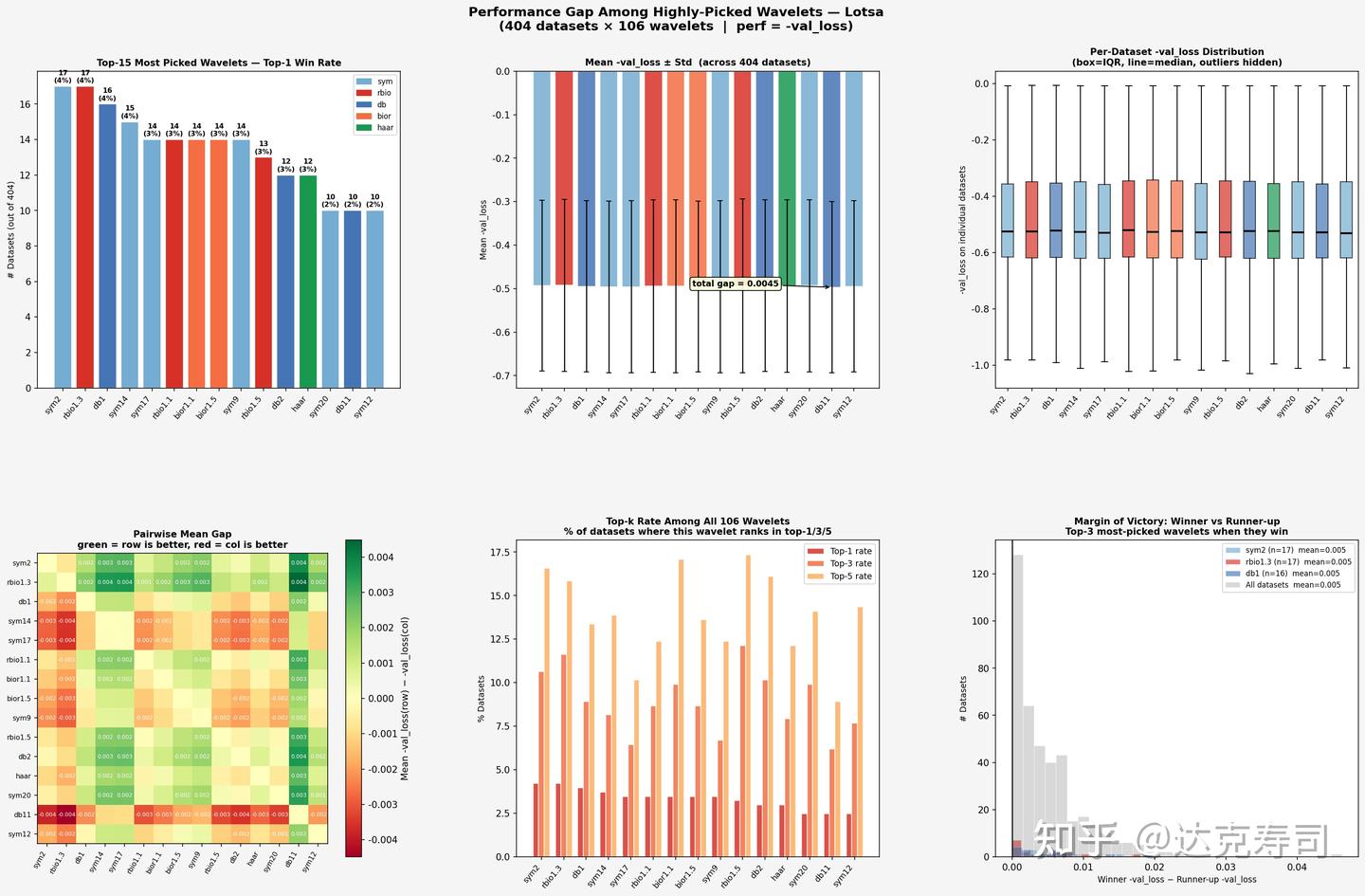
True-performance gaps among top-ranked wavelets (LOTSA)
Conclusions
For the UCR dataset
- Performance is highly dispersed. In the top-15, there is no dominant winner: rbio3.1, db3, db14, and bior2.4 each win 6 times (5.4%).
- The total gap in mean accuracy is about 0.07, which is meaningful.
- Pairwise heatmap color changes are clear, indicating real performance differences among wavelets.
- The margin-of-victory distribution is relatively wide: when a wavelet wins on UCR, it often wins by a larger margin.
For the LOTSA dataset
- Performance is more uniform. sym2/rbio1.3/db1 each win about 14-17 times (~4%), again with no absolute leader.
- The total gap in mean
-val_lossis relatively small, so wavelet performance is closer overall. - Margin of victory is concentrated near 0, meaning differences between wavelets in LOTSA are very small and winners are only slightly better.
One possible explanation is that in classification tasks, inter-class time-series differences are easier for wavelet transforms to extract. For forecasting tasks, selecting a few historically strong wavelets (such as rbio1.3) is often enough to achieve near-best results.
Next research direction:
Can we learn the most suitable wavelet transform directly from the data itself?